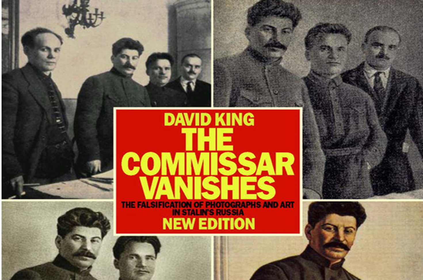
The Commissar Vanishes, by David King, 1997. Tate Publishing.
At first glance the power of the cover of The Commissar Vanishes by British graphic designer David King can be missed. A grid of dark and muddy photographs feature a set of unknown people, each with one fewer figure than before. The backgrounds are neutral but change slightly as the sequence continues. It is only upon a second look that it becomes clear: these are all the same photograph. We’re seeing a chronological removal of Soviet politicians from the photos, one by one, leaving a lone Stalin standing in the bottom right of the cover.
The book, first published in 1997, tracks the history and tools used in the Soviet Union to literally erase Stalin’s enemies from historical records and images. At times harrowing, it is always fascinating—as much a book about the nature of representation and the portrayal of history as it is about the dictator and his purges. To open the book is to take a dizzying journey through the paranoia of the Soviet regime in the 1930s and ’40s. One after another, cleanly laid-out spreads show the devolution of photographs, each dissident’s visage scraped from the images at the same time he was shipped off to the gulag. In one particularly poignant example, King shows us the evolution of a photograph documenting a meeting of fourteen Bolsheviks, originally taken in Siberia in the summer of 1915. In a second iteration of the photo found in Moscow’s Central State Archives, Lev Kamenev’s image has been hastily blackened out. Kamenev himself was back in Siberia when the image was doctored, although not by choice—he was sent into exile after Lenin’s death. He was eventually shot after a show trial in 1936. In a third iteration of the photo, published in a 1939 commemorative album titled Stalin, the group has dwindled to eight, with Kamenev’s black spot neatly filled in with snow-covered pines. In a final image, only Stalin remains, enlarged and clearly airbrushed. This image was published in another 1939 portfolio, also titled Stalin.
Later in the book we see how the purges affected everyday citizens, as King unearthed hundreds of examples of individuals taking the initiative to scratch, scrape, paint over, and otherwise deface and remove undesirables from personal books and photographs. While this is a book about authoritarian terror, at least part of the book will feel familiar to those in the West. The book’s first sentence reads, “Like their counterparts in Hollywood, photographic retouchers in Soviet Russia spent long hours smoothing out the blemishes of imperfect complexions, helping the camera to falsify reality.”
King also designed The Commissar Vanishes, and all the photographs were culled from his massive personal collection of Soviet photography. In 1970 King—then designing for the Sunday Times Magazine—was sent on a work trip to the Soviet Union to look for photos of Lenin. That research led to an obsession with the erasure of Leon Trotsky from the Soviet popular memory. In Commissar, King turns this absence into a presence, marshaling the photographs Stalinism butchered as spirits or ghosts: benevolent in returning dignity and memory to the victims of the purges, and malevolent in their righteous haunting of the authoritarian impulse.
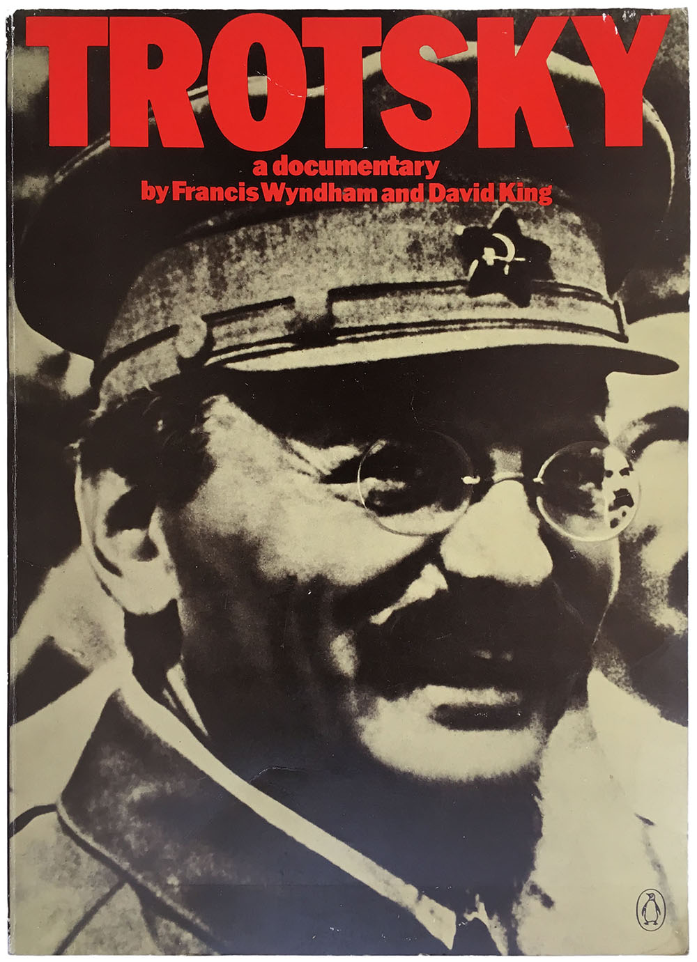
I too have long felt that images are haunted by their pasts. Now, after King’s death in May 2016, it seems like a fitting time to examine how his own images were shaped by their—and his—antecedents. King’s rigor and commitment still haunts design—or at the very least it weighs on mine. I neither knew David King nor had the privilege of absorbing the peak of his design while he was making it; I was barely in kindergarten when King’s posters provoking resistance to apartheid and racism were covering the walls of London in the 1970s. One of my big regrets is never getting a chance to meet or interview him. My current work designing for the campaign to close the Rikers Island Jail Complex is inspired by his commitment, driving me to rework and reimagine how to bring the strength and ideas of those our society has removed from view back into our sightlines.
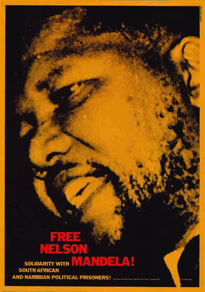
King was born in 1943 in Isleworth, on the western edge of greater London. His eclectic set of skills and interests made for a full and varied career as a typographer, a designer, an author, a curator, a photographic editor, and a committed socialist. While King’s world as a thinker, a documentarian, and an editor revolved around the early history of the Soviet Union, his core political commitment was to contemporary antifascist and antiracist movements. He designed for the Anti-Apartheid Movement in London, the Anti-Nazi League, the Namibia Support Committee, Rock Against Racism, the United Nations Centre Against Apartheid, and the Zimbabwe Emergency Campaign Committee.
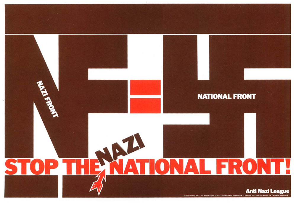
He had studied typography in the 1960s at the London School of Printing with Robin Fior, a typographer and designer heavily involved in anarchist-influenced organizations such as the Campaign for Nuclear Disarmament. Fior modeled a life where work and politics were never separate and introduced King to the work of the Soviet Constructivists, whose aesthetic leanings linger in his work. The Constructivists—including Liubov Popova, Alexander Rodchenko, and Varvara Stepanova—were an evolution of Russian Futurism. At the movement’s core was a utopian impulse, the desire to merge culture and the political aspirations of the Russian Revolution. In the early years of the Soviet Union, their experiments in painting, sculpture, theater, poetry, and graphic and industrial design were celebrated by the state, but when Stalin came to power he began to curtail their independence. Not only did he reject their avant-garde aesthetics for what would eventually be known as socialist realism, but by the 1940s a significant portion of these artists had been banished or assassinated, a history King touches on in Commissar.
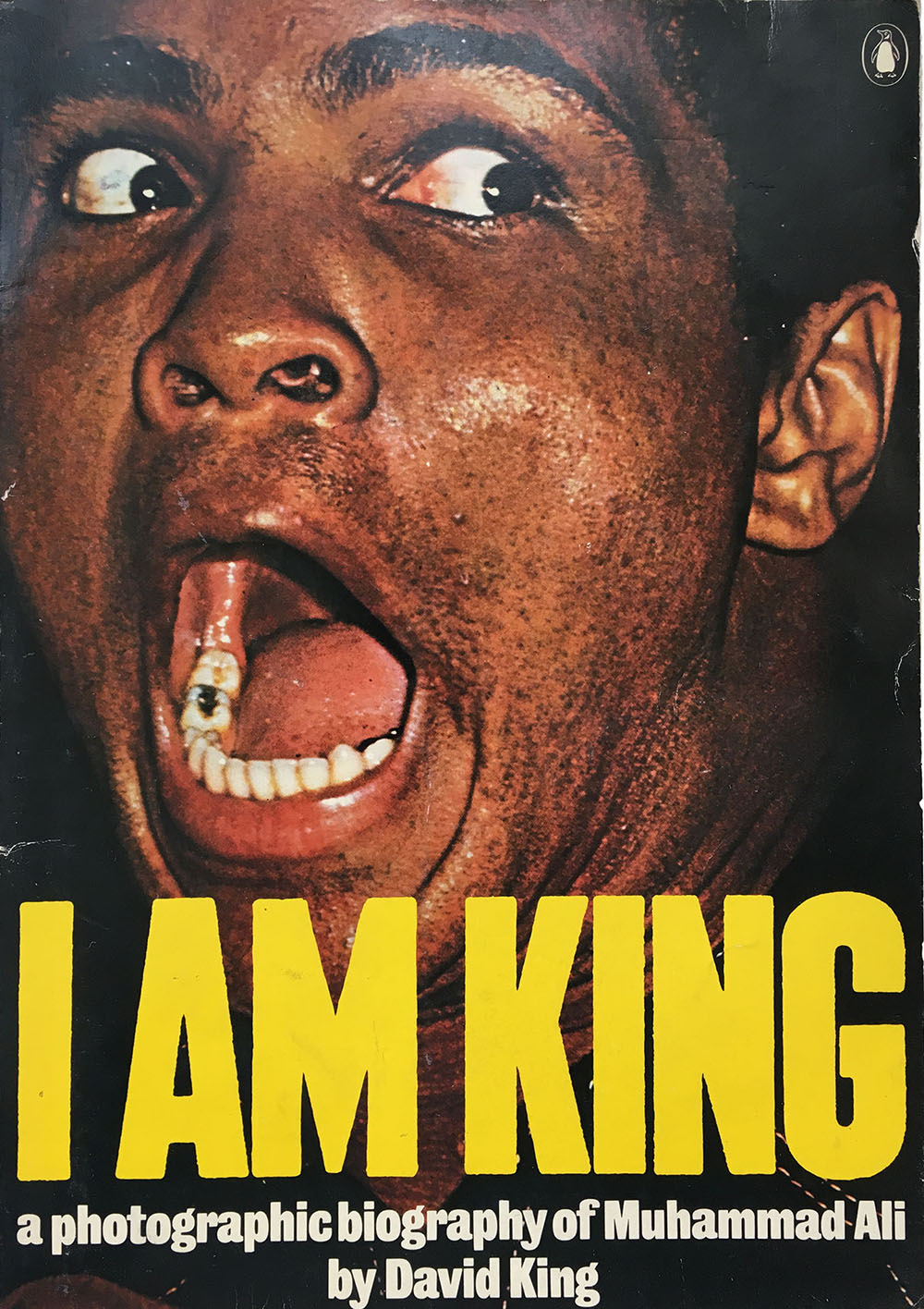
One of many aesthetics that commercial designers can pull off the shelf (like punk, psychedelia, or Dada), Constructivism has communist roots that cling like ghosts to advertisements for the crassest of commodities—from Smirnoff Vodka to Saks Fifth Avenue shopping bags from 2009 exclaiming in sharp angles and a white, black, and red color palette, “Want It!” In contrast, King was able to use the specter of the Soviet utopian impulse to bolster the social struggles of his time. His early commercial and editorial work allowed him to hone the skills he would later use in his political work. His 1975 book on Muhammad Ali, I Am King, is a good example. Although the design is deeply informed by his time at the Sunday Times Magazine and work doing record covers and other commercial work for a couple design firms, many of the visual elements that would become hallmarks of his political posters a couple years later are already in place: hulking sans serif type, full-bleed photography that pushes against the limits of the page, montage, and a penchant for yellow evident throughout his career.

The flow from pop to politics is pronounced in the whole of King’s portfolio. Designs for late 1960s album covers for The Who, Jimi Hendrix, and even Badfinger are informed by the history of communist propaganda, and in turn informed King’s work for Rock Against Racism and the National Union of Journalists.

After finding a slightly damaged copy of The Commissar Vanishes at a Massachusetts mobile book fair, I began to see King everywhere, particularly the design credits for the covers of left-leaning books from the 1970s and ’80s. Anyone who collects books from that period likely owns King-designed covers. He designed dozens of covers for Penguin, and popular books by Solzhenitsyn, Marx, and Hemingway are likely the main contact those outside the UK had with his work. The cover for Nigel Grant’s 1979 book Soviet Education is a good example of how he used Constructivism to make such books attractive for a wider audience. On a white field, the title and author are set in a bold, black Franklin Gothic, above and below thick black bars. A Cyrillic alphabet fills the center of the cover, deftly illustrating “education,” the choice of a rough stenciled font evoking early Constructivist-influenced children’s books. A number of Constructivist elements are a constant in King’s design; thick, solid bars show up not only on his Soviet-inspired work but also on covers for a civil liberties manual, a fascism reader, and a volume on black British resistance. Intense angles for both text and image are also common, whether as an accent, such as on the cover of René Dumont’s 1988 book False Start in Africa, or as the engine for the entire design, as on Sebastian Cobler’s 1978 book Law, Order and Politics in West Germany. Sometimes King simply lifts part of an image from a Soviet poster and repurposes it for a cover, such as a 1920 Alexander Zelensky graphic used on the cover for Solzhenitsyn’s 1973 collection Stories and Prose Poems.

King had the ability to make the simplest of design elements feel like a revelation. Over a twenty-year period he must have produced thousands of flyers, posters, publication covers, T-shirts, and buttons for a stable of political movements. Each design is striking, despite often using little more than bold Franklin Gothic typography, thick bars, and a relatively tight and fixed color palette. The continued use of such simple elements seems as if it might quickly become exhausted, as if King had run out of ideas and was simply running on fumes. But the opposite is true. The more he dug his heels in, reworking and reinventing these same elements, the more interesting his work became, showing the connections between movements and moments that once seemed disparate. The flared arrow he created as a central element in the Anti-Nazi League logo reappears in a series of “Apartheid in Practice” posters he designed for the Anti-Apartheid Movement, functionally connecting the struggles against fascism in the UK and apartheid in Africa and creating a visual platform for cross-movement organizing.
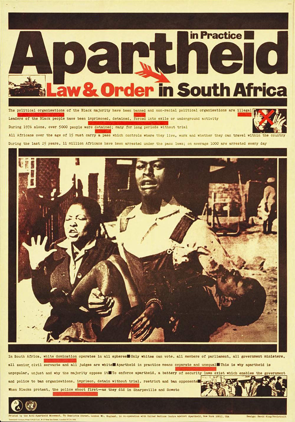
King designed at least three dozen posters, flyers, and publication covers for the Anti-Apartheid Movement over two decades. It's actually almost impossible to get a clear count of his output because his designs were so effective that they completely transformed the overall aesthetics of the movement, spawning a flow of print work riffing off or directly copying his work. More than any other designer, King pushed the presence of Southern Africans into the consciousness of Londoners and across the Anglophone world. Whether in his anti-apartheid work or in his use of the visual record to document the Stalinist purges in The Commissar Vanishes, King used the tools of design and the graphic arts to make visible the hidden and disenfranchised. His influence as a designer is visible everywhere these days, whether on the covers of rock albums by bands such as Franz Ferdinand or in the work of artists such as Shepard Fairey. What is sadly missing is his commitment to bringing the marginal into the center.